Makeup By Kim Porter

blog

The Blog

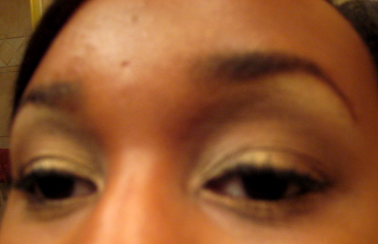
Chocolate & Vanilla Eye

This isn’t one my favorite, but I’m still going to post it.  I used the 120 Palette 2nd Edition.  I just got it so I have to try it out, which is why I’m using it so much now.  Plus, I LOVE it already!

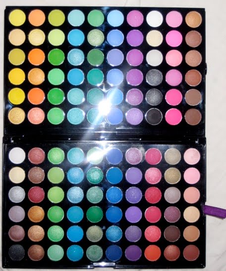
Here’s a pic of the palette for reference again.

  1. Brow bone for Highlighter: Matte Cream E/S – 4th row, last column (Bottom half of the palette) & Shimmery vanilla/cream E/S 2nd Row, 8th Column (First top half of the palette)
  2. Crease: Matte Brown E/S Last row, Last Column (Bottom half of the palette). Shimmery bronze E/S last row, 2nd column (Bottom Half of the palette)
  3. All over lid: Shimmery vanilla/cream E/S 2nd Row, 8th Column (First top half of the palette)
I lined my eyes with MAC’s black track gel liner, and used YSL’s Volume Effects Mascara
I appreciate any comments and/or suggestions.  

20% Off Stila Products


Become a fan of Stila on Facebook & earn 20% off your order.

Here’s what you have to do:
1. Become a Fan.
2. Post “I am the ultimate Stila Girl!” on our wall.
3. We will message you your coupon code for 20% off your next purchase!

***Already a fan? Don’t worry, you are not left out. Just post “I am the ultimate
Stila girl!” and we’ll send you a coupon code too!

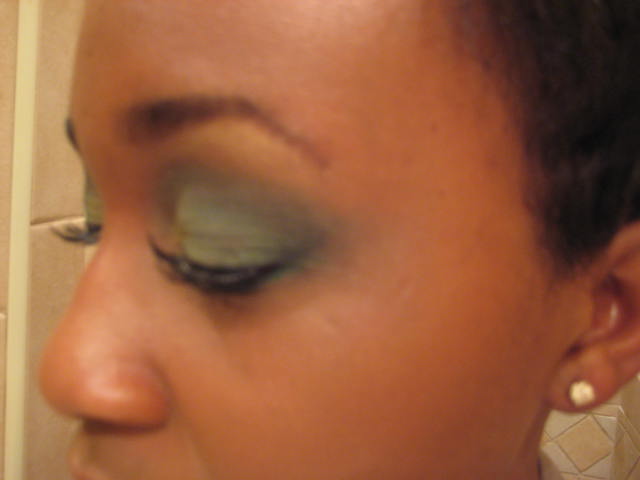
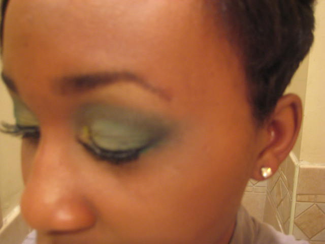
Sultry, Smoked out Green using the 120 Palette

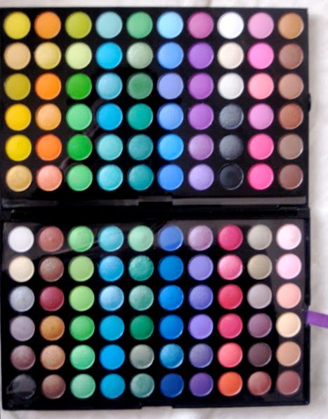
All of the eyeshadows used were from the 120 Palette 2nd Edition, which can be found here.  I LOVE, LOVE, LOVE this! I’ll get back to that on another post though.

Here’s the palette I used.  They don’t have names, so I will reference them by row & number.

  1. Tear Duct & lower lid: Yellow E/S – 6th row down 1st column (First top half of the palette)
  2. Lid & Crease: Green E/S – 3rd row 3rd column (First top half of the palette)
  3. Brow highlighter: Shimmery vanilla/cream E/S 2nd Row, 8th Column (First top half of the palette)
  4. Corner: Black E/S – Last row, 8th column (First top half of the palette)
  5. Crease (to smoke it out & blend): Brown E/S 5th Row, Last column (First top half of the palette)


Sigma Brushes used:
SS219 Pencil Brush
SS224 Blending Brush
SS239 Eye Shading Brush

If you try this out, please let me know.

Enjoy,


Taupe is DOPE!

This mushroom-esque hue is instantly intriguing.  The reason is simple: this unique and earthy tone is the perfect complement to spring’s biggest trends.  After all, a neutral nail is the perfect partner to the season’s soft clothing colors—mid-blue hues, khaki galore, and even pretty pastels—all of which point to fashion’s warm-weather shift to a more grounded direction.
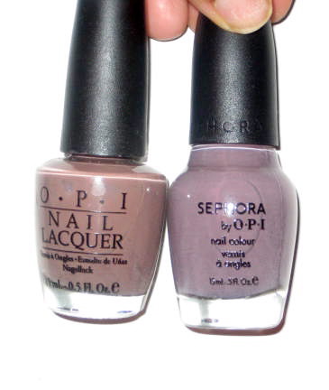
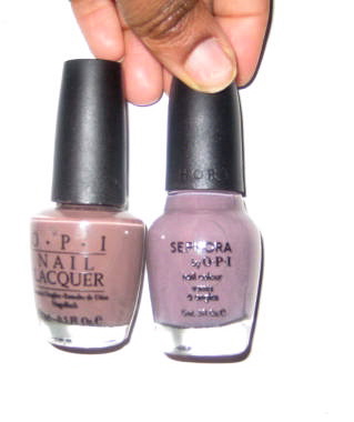
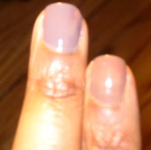
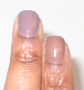
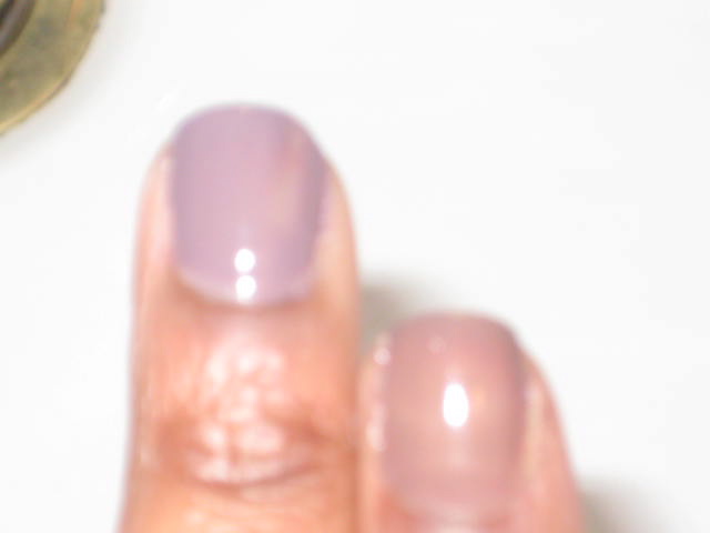
OPI’s “Over the Taupe”: I bought this sometime last year looking for a nice brownish grey nail polish.  It didn’t suit my tastes.  It looks very “fungal” on me.  For those OPI enthusiasts familiar with signature shades, it is a mistier, less gray  (Very brown in my opinion) variation of last year’s matte-nail, “You Don’t Know Jacques!”
Sephora by OPI’s “Metro Chic” – Dark Smoke with a hint of purple.  This one is my favorite.  This is an ideal nail color for someone who is not quite ready to say goodbye to gothic shades, but is still fearless enough to try cutting-edge color.

*** Metro Chic on the left, Over the Taupe on the right.


I try to get all of my OPI nail polishes from Salon Savings since they always have them for at least half the price.

Read more: http://www.mylivesignature.com/mls_wizard2_1.php?sid=54488-56-C78DB07C28375BFEA5904CA0B6AA642D#ixzz0dRpeAEzB